Once a Phasing Analysis has been performed you need to be able to understand the
analysis, and the quickest way of doing that is visually, by simply looking at the chart. The results of a phasing analysis are presented graphically in two ways:
Using Hurst's diamond notation.
With semi-circle representations of the cycles.
You can choose to display one or other, both or none of these representations of
the analysis, using the Phasing button in the toolbar.
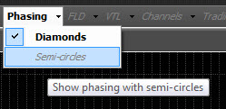
Select the diamond notation and the semi-circle notation by clicking on the small
arrow to the right of the Phasing button. Turn all representation of the phasing
on or off by clicking on the Phasing button itself.
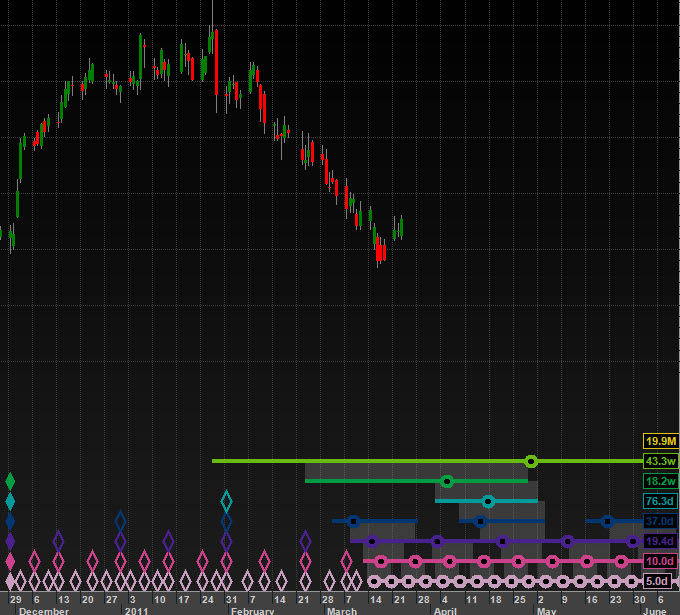
Hurst's Diamond notation
Hurst proposed using a diamond notation for displaying the results of a phasing
analysis. When using diamond notation:
A trough of a cycle is marked at the foot of the chart by drawing a diamond at the
appropriate date & time just above the x-axis (time) scale.
If the analyst is confident in the position of this trough (it is considered confirmed)
then the diamond is solid, otherwise it is drawn as a hollow outline only.
The troughs are arranged in rows, according to cycle length. The shortest cycle
is placed lowest on the chart, with the longer cycles placed higher up.
The result is that long cycle troughs are represented by a tall pile of diamonds
(because
of the Principle of Synchronicity shorter cycles have synchronous troughs),
whereas shorter cycle troughs are represented by shorter piles of diamonds.
The range of time in which future troughs are expected is presented as a horizontal
line, with a hollow circle marking the most likely time for the trough to occur.
This combination of a circle and horizontal line is often referred to as the "circle-and-whiskers"
(a name provided by beta-testers of Sentient Trader)
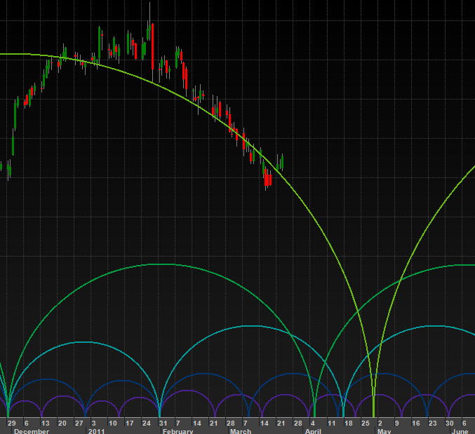
Semi-circle representation
The representation of cycles with semi-circles makes it much easier to visualize
the meaning of the phasing analysis, by seeing an imaginary cycle path as represented
by the semi-circles. There are some limitations with this representation however,
for instance the range of time in which a future trough is expected is not displayed,
only the most likely time.
This video explains how the phasing analysis is presented graphically on the
chart: